

The Project
A new start-up luxury cleaning brand has been developing a premium washing-up liquid and is now ready to build a brand and launch the new product. The new brand is called CONCIERGE and needs to develop a typographic-led identity, which should be applied initially to the new bottle.
The client has provided some strategic work showing the competitor landscape and target audience.


Moodboard

The Process
During my research process, I explored different aesthetics and design styles. I felt that the best
route to go down was an abstract route.
This gives a product a cleaner finish in turn
making it look luxurious.
When it came to colour exploration, the idea was to go for block pale but bright colours as it would make the cleaning liquid stand out on a shelf full of cleaning products.
TYPOGRAPHY
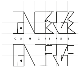
I explored different areas of typography and basic design ideas that were associated with the word CONCIERGE before coming to an abstract conclusion. This inspired me to created my own typeface for the brand. Below is the logo created
and the typeface designed to suit it.
The letters are designed to merge with each other when put together to form words. This creates different designs for each word that work well as an abstract design.
Final Designs

